There are moments when aspiration can only be realized with new architecture—when clarity of vision demands you take something down to the studs and rebuild. We at Mentor Collective found ourselves in that rare moment earlier this year: the acceleration of change as we pivoted from a Tech-as-a-Service (TAS) model to a product-driven approach demanded a full reimagining, reflecting our role as essential, human-centered, AI-powered infrastructure.
Today, we’re excited to introduce the creative expression of our strategic evolution—a new visual identity and website that reflect who we are right now: the definitive AI-powered operating system for mentorship.
For 11 years, our core purpose has remained steadfast: to illuminate the path to success for all. We now have the tools to scale our story and achieve our mission of mentorship across all sectors.
Our New Brand: Architecture Meets Aspiration
Our strategic pivot bursts to life with a new brand identity and website. Every element—from the color palette to the animation to the font choices—is intentional, designed to communicate our values and full scope of work.
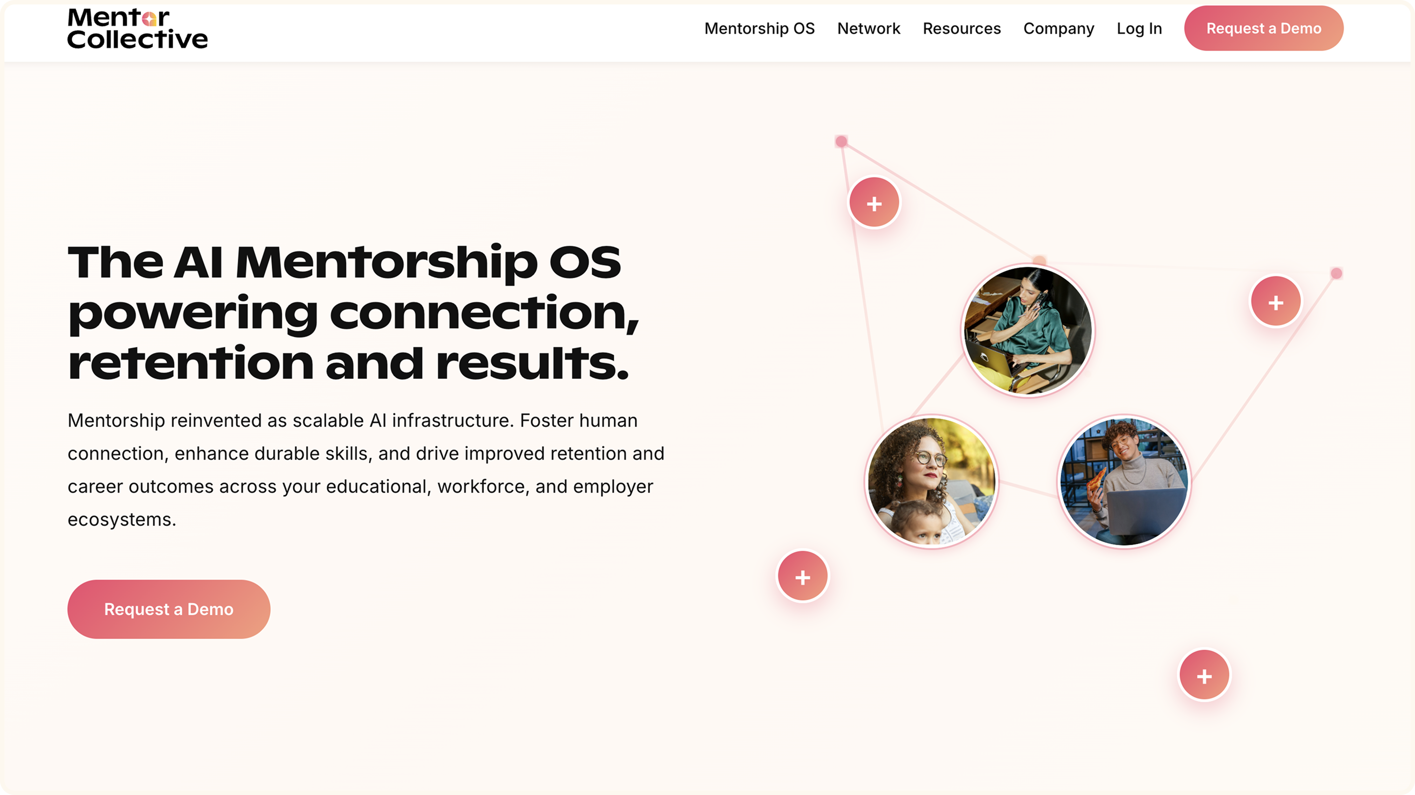
A System for Storytelling
We’ve built a brand system that clearly signals our evolution into an AI-native tech company—one that puts meaningful human relationships at the center. The design language reflects hope, ambition, and innovation, with bright, purposeful lines that symbolize clear pathways to opportunity.
Our Characters
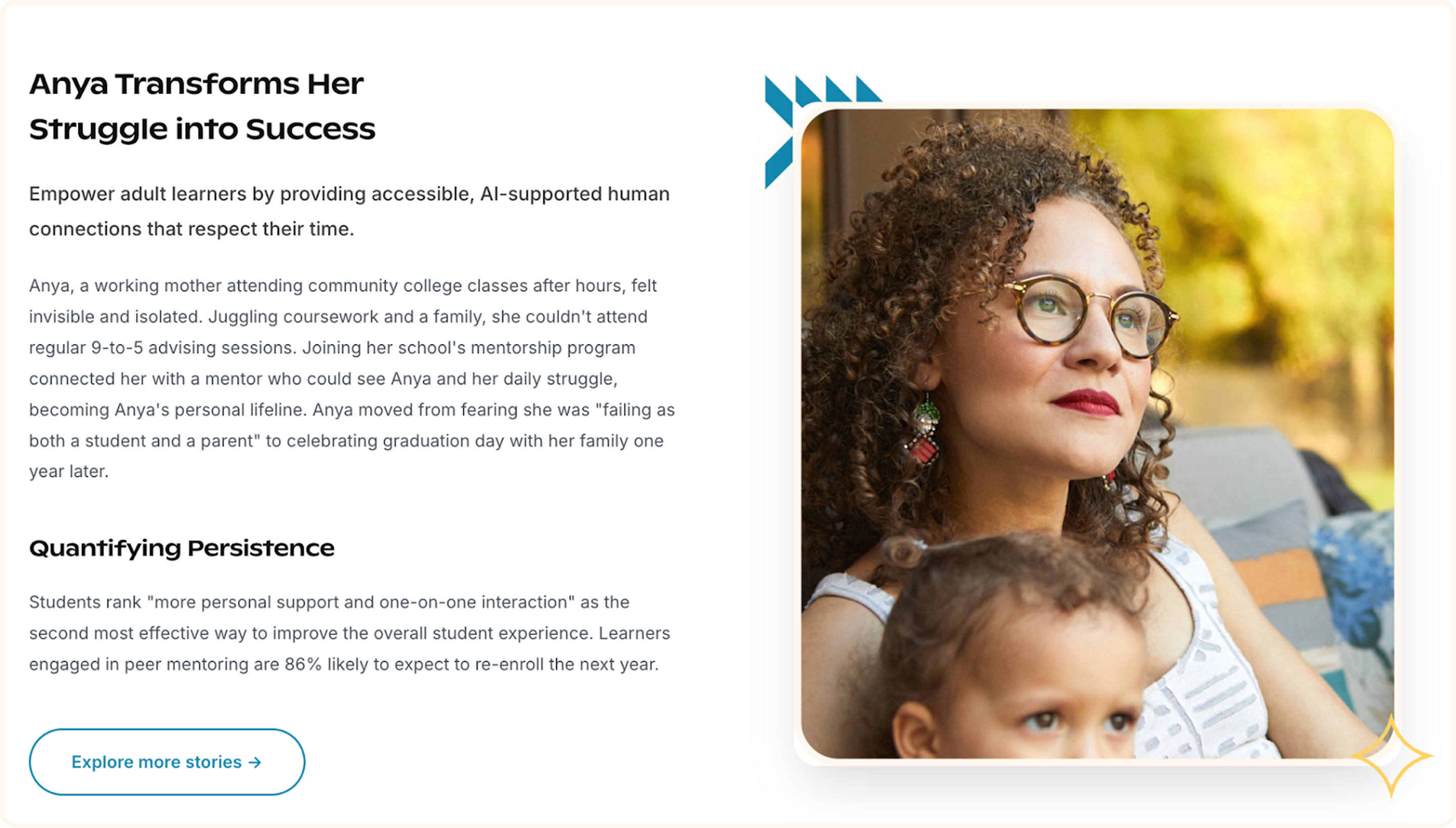
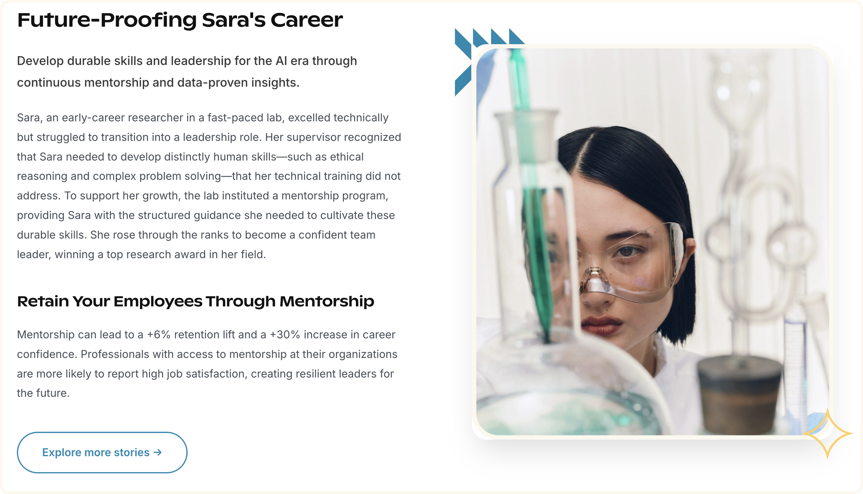
Mentorship benefits everyone, at every stage of life. Our collection of characters and their diverse personal stories communicates how lives can be profoundly improved through mentorship. Our heroes are at different stages in the learner-to-career journey: a first-year college student, an early-career professional, an apprentice, and a working parent going back to school. This device communicates the diverse audience we serve and the real struggles they face.
Photography
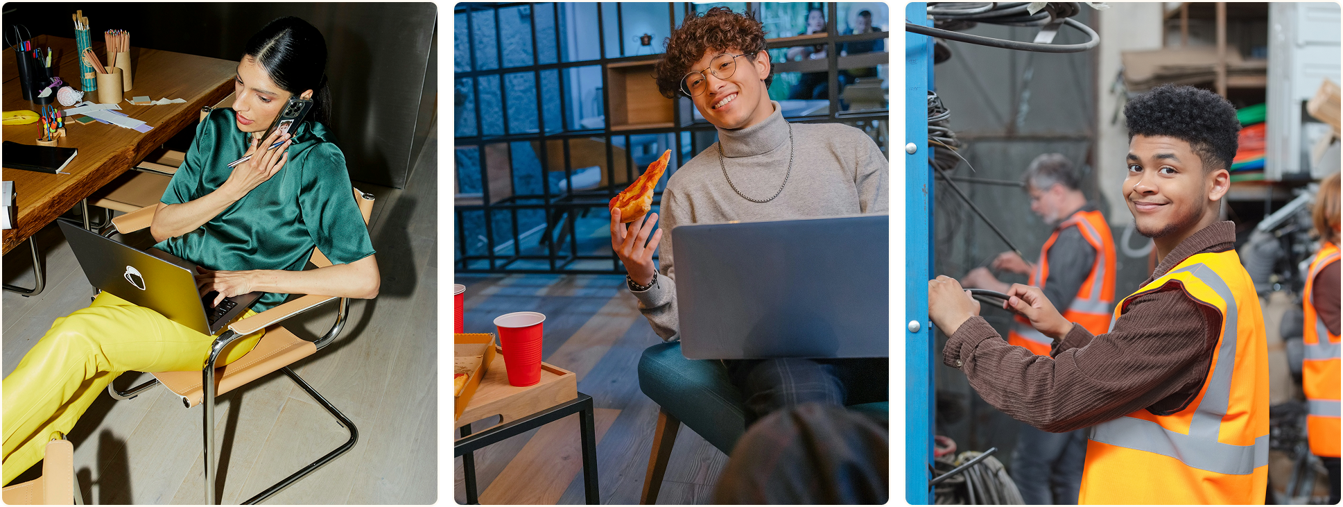
Image selection was carefully considered. No more images of sterile boardrooms with formal handshakes for us. Our new imagery steps into a fresh reality—a messy desk, trash falling out of the can, spilled coffee on the keyboard. A child on your lap while you juggle a laptop. Studying with friends while devouring pizza. There is beauty and truth in the messy, authentic reality of human lives, and we hope our viewers can see themselves in these stories; the truth is, we are all somewhere in the learner-to-career cycle at this very moment.
The Color Palette
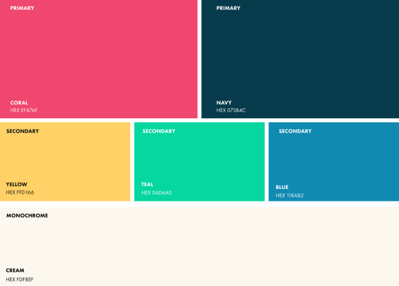
Our colors are chosen to convey vibrancy, stability, and innovation.
Vibrant Coral and Yellow in ombre tones suggest movement, innovation, energy, and optimism.
Navy provides a grounded anchor, reflecting our roots and measured approach.
Medium Blue softens the edges and balances brightness.
Cream is a neutral, warm, and inviting alternative to sterile white.
The Geometric Motif System
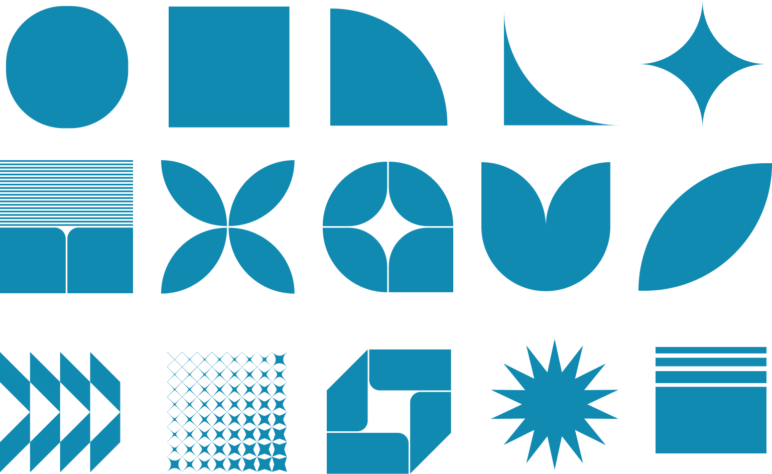
This system acts as modular building blocks for a consistent brand language. These bold motifs bring energy and movement to the page. The geometric system is built from core shapes (circles, semicircles, squares) mirroring how the OS works: small inputs create powerful networks.
Typography
New fonts balance our professional credibility with approachability. Inter is a bit more formal and serious, while Ginto is rounded and slightly flattened, giving an open, accessible, playful, yet sturdy, feel.

The Centerpiece: Our Logo and Wordmark
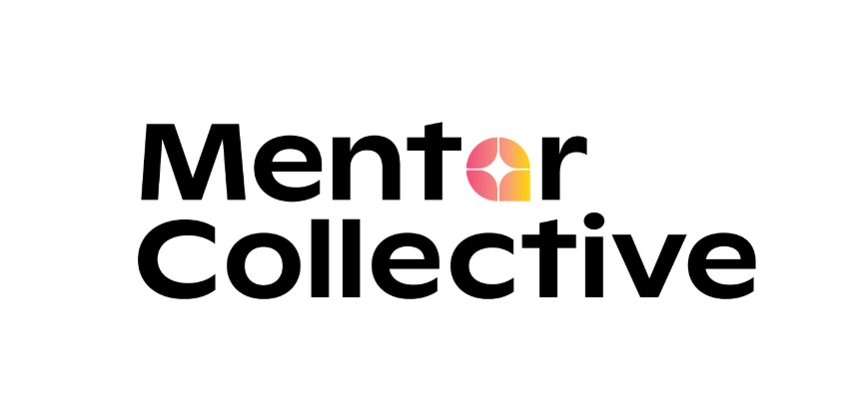
The Mentor Collective wordmark strategically features our new logo standing in for the "O" in "Mentor," with the Ginto font providing an open, playful yet sturdy feel to the name.
The logo is a layered symbol, thoughtfully designed to reflect the heart of our mission. Its shape resembles a speech bubble, representing open dialogue, human connection, and the power of meaningful conversation.
At its center is a dynamic spark or star, with radiating lines that echo our first AI product, Conversation Sparks. It symbolizes that electric moment of genuine connection—a burst of insight, energy, or empathy that defines impactful mentorship.
The form can also be interpreted as a wayfinding symbol or map pin, marking a place of belonging or a turning point on someone's personal or professional journey. It reflects our role as a guidepost—helping learners and mentors navigate their paths with clarity and confidence.
The vibrant ombré gradient infuses the mark with movement and energy, suggesting momentum, progress, and a sense of optimism. It’s a bright and hopeful emblem of innovation, with a human core.
Our Website: The Front Door to Who We Are
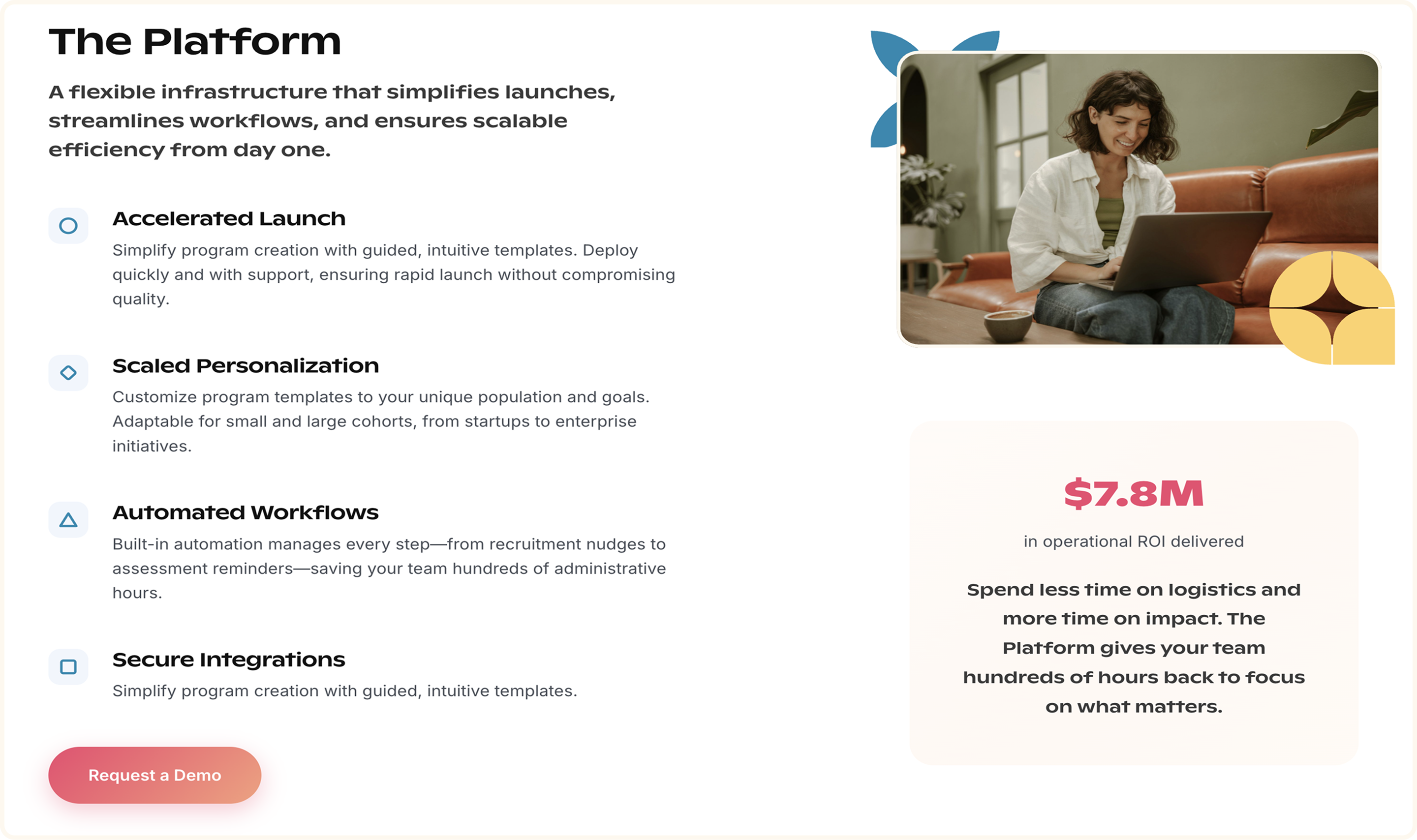
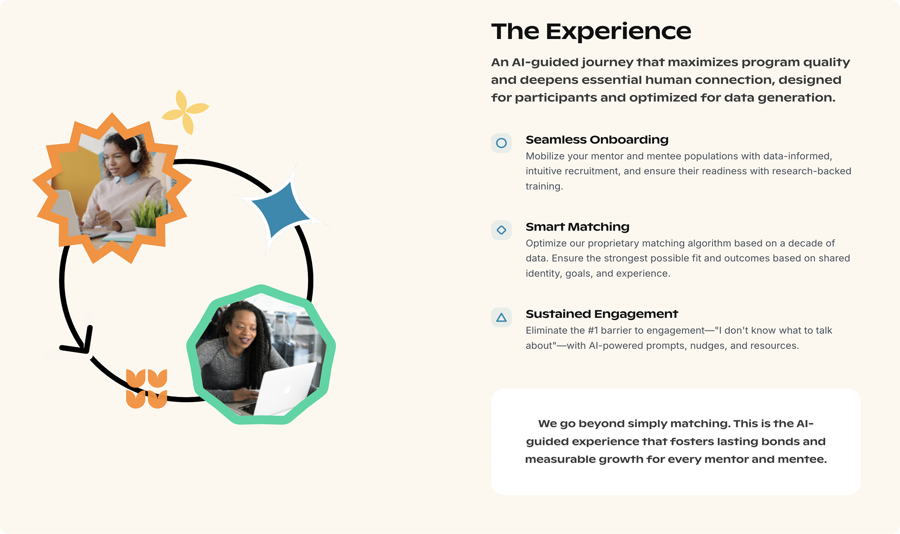
Our new website is our most powerful communication tool, and the tangible realization of our strategic shift as an AI product-driven company. It was built for clarity, scalability, story-telling and precision.
Engineering for Scale:
The site was built using hxMC-react, a custom React-based HubSpot theme, powered by over 35 modular drag-and-drop components. The components reflect the brand's geometric architecture and narrative style. The resulting website is engineered for long-term scalability, responsiveness, and ease of iteration, supported by agentic AI workflows for rapid code review, refinement, and expansion.
Interactive Storytelling:
The visuals convey that we are tech-focused, yet always human-centered. Imagery paired with real stories shows how lives can be profoundly changed through mentorship. Graphics subtly glow and flicker like stars in a constellation, symbolizing how we illuminate pathways for learners to grow, connect, and thrive. Key areas are interactive—hovering reveals deeper insights, while animated lines and pathways visually bridge employers, institutions, learners, and talent. Every element is designed not just to inform, but to spark joy and curiosity, inviting users into a vibrant, dynamic experience that reflects the transformative power of connection.
Aspirational and Innovative:
The entire design evokes hope, aspiration, and innovation, with bright, clear lines communicating pathways to opportunity.
The Bigger Picture
This new brand and website aim to maximize our positive impact in the world. They provide the sophisticated infrastructure needed to amplify our mission across the entire learning-to-career spectrum. Our systems now scale to fulfill our mission of mentorship for all.
We are so proud to have been doing this work for 11 years, and we can’t wait to share the next chapters of the mentorship story with you all. We invite you to partner with us as we scale this vital human infrastructure and embrace the future of learning and work. By transforming fragmented journeys into reliable pathways, we can connect with a broader network of learners and early-career talent, ensuring that opportunities are predictable and equitable.
Spark. Reveal. Scale. Fuel.

